CNRS - INSHS / INS2I >

GDR 3359 MoDyS > UMR 3495 MAP > Modys 2012 interactive sessions visual analyses of results

> home

References sessions scenario

Scenario of the session: participants were shown 44 more or less classic visualisations, dedicated to the representation of quantities AND/OR spatial data AND/OR temporal data. They were then asked to say whether they know / use these types of viz.

1. Bubblechart

Visual result 1: a bubblechart used to measure the impact of space/quantities/time categories of visualisations - in particular to check whether time-oriented data visualisations have an impact that compares to this of spatial data visualisations. The answer is no. (SVG , tested on Internet Explorer and Firefox, opens in new window)

2. One to one data rings

Visual result 2: data rings showing each vote (including discipline of voter) for two visualisations. This is used to compare the impact accross disciplinary fields of various visualisations. It helps spotting possible diciplinary patterns (there are some, but they scarcely appear on the overall). It also helps checking whether some time-oriented data visualisations are equally poorly known accross disciplines (the answer is rather yes). Only some of the 946 possible one to one combinations are shown here. (SVG , tested on Internet Explorer and Firefox, opens in new window)

Terminology sessions scenario

Scenario of the session: For each of a selection of 74 terms (distributed accross four categories, namely processes, time, uncertainty, general vocabulary) the organisers proposed definitions in French and English. Participants were asked to say with which of the definitions they agree and with which they disagree (in fact, which they consider as relevant in the context of their own research and discipline, and which they consider in conflict). In addition, a fifth category, called "tabula rasa", was left empty at the start of the event. It was used by participants to add new terms (12) to the collection and to get a first insight on how these terms are used and understood by others.

The visualisation

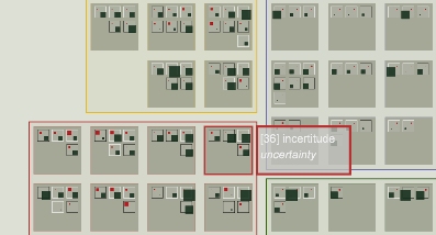
The result of the session (48 voters, 86 terms, 250 definitions, 2562 votes) is shown though a visualisation that is somewhat loosely inspired both by Jazwinski's "franco-polish method" (XIXth century mnemonic method) and by F.Viegas and al.'s "Post history" (contemporary email history viz).
A first-level reading is composed of a grid of grids where only the collection of terms is available, including definitions in both languages, so as to weigh the collection itself (number of terms per category, number of definitions for each term in each langage). Two interactive focus views are interactively available where actual votes are shown :
- globally, as an overlay of the terms grid, so as to emphasize areas of agreement and areas of disagreement (higher for the "uncertainty" category),
- term by term, with here each definition and each voter being shown, so as to fine tune observations, notably by introducing the disciplinary bakground of voters.
(SVG , tested on Internet Explorer and Firefox, opens in new window)